In order to start from the beginning of my blog, please click the link below and then scroll down as far as you can. You will see my first post. The last post will be at the top of this page you are on now:
http://rorymakesfilms.blogspot.co.uk/search?updated-max=2012-10-19T01:20:00-07:00&max-results=7&start=21&by-date=false
Thursday, 25 April 2013
Friday, 22 March 2013
Full Coursework Evaluation Presentation+Video
For my evaluation, I made a Prezi presentation explaining how I set up a few elements for my music video and then I create an eight minute video answering all the necessary questions. This video is shown at the end of the presentation.
Here is the presentation:
Here is the presentation:
How I editied my "ShutEmDown" Music Video
Here is a full length, in depth video explaining how I did almost every visual effect and how I edited some other parts. It is 50 minutes long, enjoy.
Thursday, 21 March 2013
Creating Celldwellers Website
I started by importing some simple element to see what im working.

I then started working on the background for my website. I stuck with the same galaxy as I used in the poster to keep the identity similar.


I then massively upped the contrast until you could only see the starts and some of the nebula, then i adjusted the hue to it was a cyan colour. This linked with the orb which I added next.

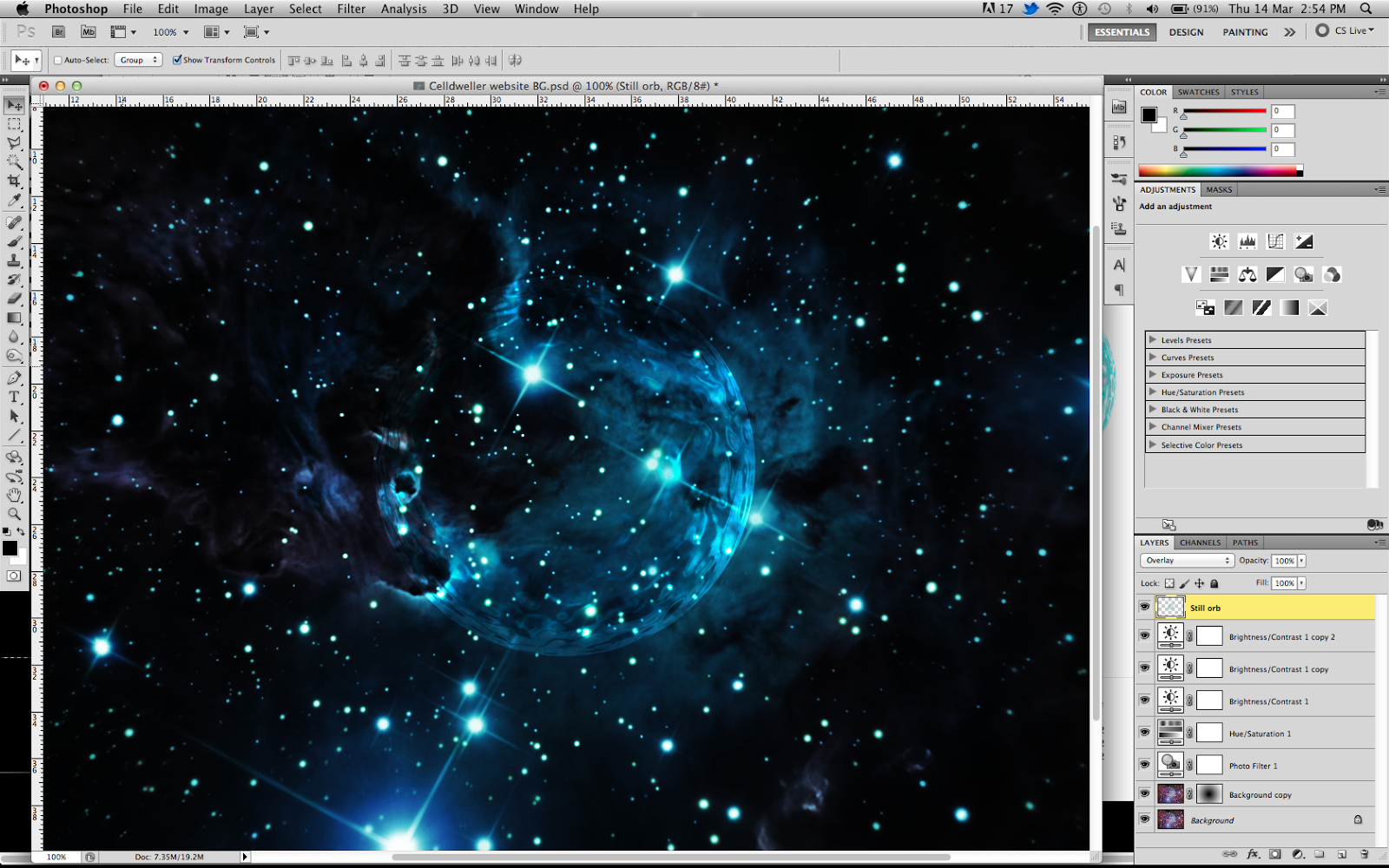
After some tweaking, I made the orb a lot subtler and larger. Then I started to add in typography. I used the "Platform Eight" typeface to, again, keep everything in the same identity.


After testing out some graphical elements for the typography, I stuck with just a simple white font so it was fully legible and then I added a zoom blur on the same layer then moved behind. Making it blue made it look more like a glow.

I then saved the image as a .jpg and put on on the site.

I added some miscellaneous parts to the websites such as a compretition, music and other little widgets.

After all this work, here is the final website:
http://waffleegg.wix.com/celldweller-rory
Researching Artits Websites
Before I went off to create a website for Celldweller, I wanted to look at a few real examples of websites for different musical artists that make music of the same genre.
The first website that I researched was infact the real website for Celldweller.
http://www.celldweller.com/site/

Important elements to notice about the webstie:
http://www.nervoustestpilot.co.uk/

Important elements to notice about the website:
The third and final website I look at was that of Linkin Park:
http://www.linkinpark.com/

Important elements to notice about the website:
The first website that I researched was infact the real website for Celldweller.
http://www.celldweller.com/site/

Important elements to notice about the webstie:
- Due to his futuristic music style, everything has a neon glow to it. Most noticeably, almost all of the type on the website. Not only was this futuristic and made it link more to the electronic genre, but it also just gave the type more depth to it. It made it more interesting to look at.
- One of the most important elements of this website was the background. The website has been moved off to one side to allow the two characters to show. These two characters are infact Celldweller himself and Klayton. In addition to the glow on the typography, there was also the same blue glow on the costumes of the models.
- The background also featured something similar to the album cover, it had a space setting with bright stars and a very futuristic looking city scape.
- When it comes to the different elements of the website, it has multiple links at the top including the name of the artist in a very large and legible font. In addition to the page links, social media links are also included.
http://www.nervoustestpilot.co.uk/

Important elements to notice about the website:
- It is clear to see that when compared to the website of celldweller, this website is much lower budget and probably no budget. All the elements are very simply laid out and nothing seems spectacularly designed. However this is not a negative point about the site. This means that everything is very obviously laid out and easy to see.
- The name of the artist is at the top of the page. This means that it is the first part to load and makes it look as if he is the creator of everything underneath, which he clearly is. Also, the green colour of it relates to the other green title text. This neon green colour is reminiscent of some sort of "terminal" command for a computer, therefore implying that he makes electronic music.
- The more important information for the artist is all on the homepage. It gives information of who he is, what he does, what his record label is and what sort of music he makes. There is still many tabs however that give more indepth information to the different areas.
- There isnt a background for this website, it is just a plain black square. This may mean something, but in my opinion it makes the website a lot more boring and less visually appealing.
The third and final website I look at was that of Linkin Park:
http://www.linkinpark.com/

Important elements to notice about the website:
- Out of the three websties, this one looks the most professional and finished as everything is obvious, everything works and there are no unnecessary features.
- The typography of this website works very well. There is no glow to anything in it. It looks more like a business site than a quickly designed site such as the site for nervous testpilot. In addition to this, the type is all white, black or grey. having colours always makes something looks slightly less professional. Having desaturated colours shows the seriousness of the band.
- Everything on the site is set up in a rectangular formation. All the information is in blocks of different sizes and because if this it links up a lot better than if it were in different positions.
- Due to the popularity of the band, there is no need for any image of them on the background. For this site it is just a grey gradient. Unlike the nervous tespilot site, the reason for a cleaner background is so it does not distract from the important information on the centre of the page.
- Almost everything is acessable from the homepage, most noticeably the homepage contains the news for the band. I like this idea as it makes it seem more regularly updated.
Creating the DigiPak Advertisement
Upon researching the three album covers as they seem to give off the best impressions of their respective artists, I used it for the production of my poster for Celldweller.
The software I used for this consisted of just Adobe Photoshop CS5 and Cinema4D.
I started by creating some 3D text in Cinema4D and then adjusting the colour and reflections so that it was legible and contrasted.

 The very first poster style I tried was just an A4 sized project, however I suddenly realised that I had infact created a poster for one of my Graphic Design units. From this, I knew that I had to use a Quad sheet for a realistic poster.

This is a Quad Sheet size (30x40inches). From looking at the album cover and using it as inspiration, I searched a while for a purple coloured nebula scene. I then added miscellaneous images of clouds that could act as extra nebulae, set the blending mode the screen to just have the white of the clouds and then coloured them appropriately.

Again, looking at the album cover, I noticed some subtle hexagons which did give the album cover more depth and made it look a bit more technological. I decided to replicate this by using Illustrator, creating multiple hexagons and replicating them many times.

This is what the hexagons eventually looked like. I then changed the colour to white and brought them into PS CS5.


As you saw, I brought all the elements together and made the hexagons "overlay" onto the background. I then erased some areas to make it seem a little more random.

Upon closer inspection, the typeface I used for the title just was not legible enough and didnt suit the rest of the poster. I researched some more fonts and then came across a font called "Platform Eight". I changed the text in Cinema4D and then brought it back into PS CS5.

Seeing as the orb was such a key part to my music video, I wanted to keep the theme of it throughout all my tasks. Due to this, I decided to make the orb very prominent in the background of the image.


After some tweaking of the song / DigiPak name, I realised that the orb needed more to it. I found some fake lighting coming out of a point, changed the colour and added a few effects to it.


After a lot of work, this is the final design.

The software I used for this consisted of just Adobe Photoshop CS5 and Cinema4D.
I started by creating some 3D text in Cinema4D and then adjusting the colour and reflections so that it was legible and contrasted.


This is a Quad Sheet size (30x40inches). From looking at the album cover and using it as inspiration, I searched a while for a purple coloured nebula scene. I then added miscellaneous images of clouds that could act as extra nebulae, set the blending mode the screen to just have the white of the clouds and then coloured them appropriately.

Again, looking at the album cover, I noticed some subtle hexagons which did give the album cover more depth and made it look a bit more technological. I decided to replicate this by using Illustrator, creating multiple hexagons and replicating them many times.

This is what the hexagons eventually looked like. I then changed the colour to white and brought them into PS CS5.

As you saw, I brought all the elements together and made the hexagons "overlay" onto the background. I then erased some areas to make it seem a little more random.
Upon closer inspection, the typeface I used for the title just was not legible enough and didnt suit the rest of the poster. I researched some more fonts and then came across a font called "Platform Eight". I changed the text in Cinema4D and then brought it back into PS CS5.

Seeing as the orb was such a key part to my music video, I wanted to keep the theme of it throughout all my tasks. Due to this, I decided to make the orb very prominent in the background of the image.

After some tweaking of the song / DigiPak name, I realised that the orb needed more to it. I found some fake lighting coming out of a point, changed the colour and added a few effects to it.


After a lot of work, this is the final design.

Wednesday, 6 March 2013
Thursday, 7 February 2013
Creating the Digipak Advertisement
For my first ancillary task, the Digipak advertisement seemed to be the most important as I could use the design from my advertisement to use on my website.
It was very difficult to find any research for my advertisement as digipaks are not in production as much as they were. Now the internet has evolved and is offering downloadable albums with "album only extras" such as an interview with the artist(s), graphics for your computer, an extra song or something similar. Instead, I researched multiple advertisements for artist(s) or a similar genre (Electronic, Metal, Dubstep, Drum and Bass etc.) and I started with the most obvious being the Album cover for Celldweller.
Celldweller - Soundtrack for the Voices in my Head Vol 2


Camo and Krooked - All Fall Down/Breezeblock

It was very difficult to find any research for my advertisement as digipaks are not in production as much as they were. Now the internet has evolved and is offering downloadable albums with "album only extras" such as an interview with the artist(s), graphics for your computer, an extra song or something similar. Instead, I researched multiple advertisements for artist(s) or a similar genre (Electronic, Metal, Dubstep, Drum and Bass etc.) and I started with the most obvious being the Album cover for Celldweller.
Celldweller - Soundtrack for the Voices in my Head Vol 2

- The main theme I can pick up from this is the Galaxy style background. It has stars, random nebula's and the main theme of the music video I made, the Orb in the main characters right hand.
- In addition to this, the colour scheme is a strong purple. Everything is tinted purple/pink.
- The main focus of the album is in the centre of the image to draw your attention to the most important point. The typography is lower down so you can see the woman clearly.
Linkin Park - Waiting For The End

- Again, it has a space theme, however for this cover it is more glitchy and computerised.
- The title for this is in the centre. It shows the name clearly and keeps everything clean.
- Its placed over the main focus though which is also good as you look at both at once.
Camo and Krooked - All Fall Down/Breezeblock

- This is not so space based, however it does show some elements that look like stars.
- The square mesh coming out of the background is similar to that of "Waiting for the end" as it looks computerised and almost like a matrix.
- The typography is very key for this. It is in large, bold letters glowing with pink and cyan. These two colours are the colours you see when a moniter of some sort glitches and so hints to their electronic/drum and bass style.
Wednesday, 6 February 2013
FInal edit for my music video
After the final colour correction and frame by frame editing, I uploaded my final video to YouTube. I used my followers to give me feedback on the video.
This is the finished video:
This is the finished video:
Thursday, 24 January 2013
Colour correcting and Grading my footage in Apple's Colour
In order to make my video have the desired look and to stylise it, I knew I had to use a sophisticated bit of software to colour correct my footage. The software I used came with my Final Cut Studio package. It is called Colour and is designed to colour grade and correct.
These are the step I took to get the final colour:
This is the original look of the raw footage


The main focus of my task was to stylise the backrgound but keep the skin tones right. Letting the skin go blue or green would ruin the grade.


I had to keep checking the scopes to see if any colours were blown out or not vibrant enough

I moved onto the next clip due to the better raw colours, used the grade from my last and adjusted it until the skin tone was pink-ish and the background was blue.


These are the step I took to get the final colour:
This is the original look of the raw footage

Using the tools available, I could correct the yellows of the mid tones to a much whiter colour

I decided to use one of the music videos I researched to colour grade from

The main focus of my task was to stylise the backrgound but keep the skin tones right. Letting the skin go blue or green would ruin the grade.


I had to keep checking the scopes to see if any colours were blown out or not vibrant enough


Tuesday, 22 January 2013
Third edit
I finally made my third edit. In this I have come to colour correct the footage and add some cleaner sound effects and also some differnt visual effect:
Friday, 11 January 2013
Bullet Hole Creation
I started by motion tracking the small rivet on the wall. I purposely filmed this because I knew I wanted to track it to add a bullet hole.


I then added the bullet hole from a picture I took form a video game and finally added motion blur.

I research some more bullet holes and saw that they always have dust or smoke coming out of them. I used the same smoke as I use for my muzzle flares.


I put this all together and used the same tracking data for the smoke.

Finally I added a glow and ended up feathering it until it was hardly visible.


Finally, I put it all into FCP7.

Subscribe to:
Posts (Atom)